
Blazing fast onboardings with UI generation
Generating a form from a JSON descriptor is a recurring problem in frontend development. In several business domains there are many complex constraints related to the attributes, which require validation logic to prevent bad requests getting through. How can we use the validation descriptors to our advantage to speed up the creation of a UI? Let’s find out.
The policy creation flow
The Policy Creation Flowis a central piece of our internal processes. It is used by both business operations and developers to create contracts on our platform. Creating a policy involves 3 API requests:
- Quote, creation request has all the pricing relevant data. An offer is then created based on the user inputs.
- Customer creation request contains customer data (name, mail, address, …).
- Policy creation request is everything else that is needed to issue the insurance contract. The actual insurance contract is created here.
Each request sent to the Policy APIs is validated through a set of validation rules, which we wrote in our own meta-language. The purpose of these validation rules is to ensure the coherence of the data inside each request and between the requests. They pose constraints on the payload attributes, such as limit range for numeric values, an array of possible string values an attribute can have or a regexp that a field must follow (phone number, bank account IBAN, …)
What’s the problem?
Previously, we were implementing the policy creation flow UI manually for every new product line. We were copying and slightly changing the react components from already implemented policy creation flows to reimplement nearly identical screens (sigh).
This solution led to countless duplications. It required the creation of hardcoded react components based on the validation rules, which can change throughout the product lifecycle. This meant even more manual intervention.
This process became increasingly costly due to the rising number of products in our offering. The duplication of form components was becoming brittle and tedious.
Our codebase structure looked pretty much like this:
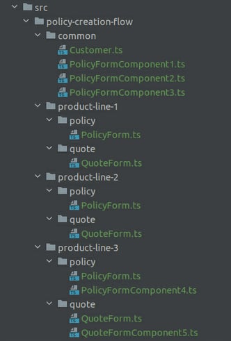
We onboard lots of products, so after a while this approach became quite laborious. That is when we thought to ourselves: wouldn't it be cool if we could just generate this UI? After all, the components are almost identical, and the information is already given in our input validation rules. So, we went on with writing a prototype for the UI generator.
The validation rules Engine
At ELEMENT, we use our own meta-language to validate the policy and quote requests. The integration of a new product is accompanied by the definition of its validation rules. It looks like this:
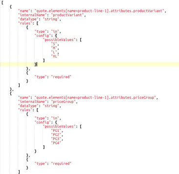
Our goal is to generate a UI for the quote, customer and policy requests starting from the validation rules to speed up our integration process for new products, since it will spare us the burden of creating/refactoring the UI components. Additionally, this makes our codebase more maintainable, since we do not have to account for individual use cases.
Our solution Design
We decided to keep our UI layout as a wizard flow, where each step of it sends a request to our API. There are 3 steps in total: quote calculation, customer details and policy creation.

The new wizard flow is stored in its own micro-frontend, and it is accessed through our administrative UI.
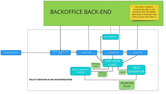
Let’s list the important points of this architectural diagram:
- We use a dispatcher to manage the state of the forms throughout the wizard. It also enables a convenient back button functionality in this flow.
- Up until now, validations only happened on the backend. With the new setup we can extend validations to the frontend as well, resulting in a superior user experience. If the frontend validation fails, then the request for its corresponding step is not sent to the API. If the backend validation fails, an error message pops up to the user, showing which validation rule was broken.
This is how a front-end validation error appears:

This is how the backend validation error message looks like:
- In our architecture design, a field generator component generates the UI for each wizard step. But how to build this “field generator” that magically generates the react form components based on the validation rules fed to it as input?
The field generator should work with single fields, arrays or references to another field. This field can also be on a different step in the flow. For example, fields in the policy creation step often cross-check the information given in the pricing step.
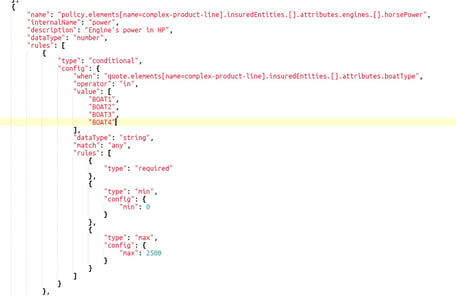
We came up with the following design for the field generator:
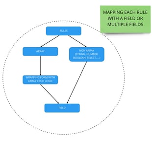
In our intended design, both the rules on single fields and arrays are reduced to render <Field/> components. <Field/> receives as prop a primitive component corresponding to the rule datatype, such as InputNumber for numbers, Select for multiple options with a fixed values, Switch for Boolean values and so on. We don’t need to create these components from scratch, we can use those provided by Ant Design (https://ant.design/), the React library we decided to use to implement our UI.
Which form library to use?
We wanted to choose a popular react library to rely on community support in case of problems. It also gave us confidence that the library will be kept up to date.
After looking at different React Form Management libraries like Formik, Final Form, react-form, react-hook-form and redux-form, we decided that react-hook-form was the best fit for us.
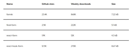
Our evaluation was driven by the current state of our backend architecture and our need to support our validation rules.
The Formik library provides a hook function, which we could use, but it doesn’t work with the <Field/>, <FieldArray/>, or <ErrorMessage/> react components. In our case, it is important to have support for such components since we decided to use the Ant Design form throughout our Backoffice micro frontends.
React-form, even if still widely used, is no longer maintained. We may want to use a library with active community support for something freshly implemented.
Like Formik, final-form doesn’t provide any "native" validation method. This would mean that the burden of writing custom validations would be on us, and there are plenty of them in our meta-language, next one!
React-hook-form has some standard validation methods to quickly set up form validation, this seemed very helpful. It is compatible with the Ant Design form as well, so we decided to use this library.
Let’s see how react-hook-form works. An easy example is using the basic useForm() hook provided by react-hook-form (example available at https://react-hook-form.com/):
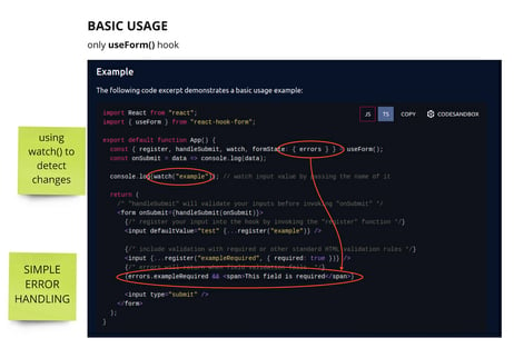
Our form implementation
We use the <Field/> component, customizing it depending on the rule data type and injecting the validation rules into it:
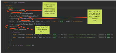
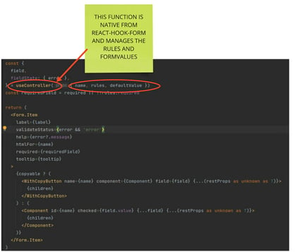
In our case, we also need to implement our custom validation logic and error handling. For that, we use the useController() hook included in the react-hook-form library.
Here is the implementation of <Field/>:
Conclusions
Implementing a form UI that has solid validation is a recurring issue in frontend development. We took advantage of the already existing meta-language, letting it drive the field generation in our forms. Our implementation had to overcome many issues due to the wide range of rules provided in our meta-language. For example, fields of one step affecting another step, validation rules that are only enforced in a certain condition and validation rules applied to arrays.
We are very satisfied with our results. The policy creation flow is not a topic at onboardings anymore, it just works out of the box. Now it is time for us to think, about where we could use this approach in other solutions as well.


